Recently Graduated Data Professional Seeks Affordable Life Part 2

Exploratory Data Analysis
Published on December 01, 2023 by Bethany Blake
python data science technology
11 min READ
How It’s Going
1. Introduction
When last we left our recently graduated data professional, they were attempting to assess the affordability of each state. While many factors contribute to the affordability of a living area, comparing income with housing cost is an effective place to start. For our newly graduated data professional, the greatest concern is likely to be which state will have the best salary paired with whether that salary can afford the rent for a decent apartment. As their career progresses, that perspective will change to what salary is possible for the career trajectory in their state and how long it will take to become a homeowner.
Additionally, since this data is viewed at a state level, this exploratory data analysis will all cover tax burden. The impact of state property, income, and sales tax will affect our data professional differently as they progress from renter to homeowner, as well as from a junior income earner to a senior income earner.
The research questions explored below are:
- Which areas pay the salary for data analysts and data scientists?
- How does this pay vary compared to the average wage across all industries in this area?
- What is the availability of data jobs in this area?
- How do rent costs compare to average pay for data professionals?
- What does the path to homeownership look like for a data professional in each area?
- How do the tax burden in each area impact affordability and does that tax burden change as a data professional earns more income and transitions from renting to home ownership?
(A note for user accessibility to the data visualizations: At the time of this posting the figures shown have been uploaded in a static format, due to technical issues with template of this blog reading certain html components. However, all of these graphs were generated in plotly, which means in their original form there is an ability to hover of areas of the graph to view details for each state. To view these data insights, please see the companion Streamlit dashboard for this analysis.)
The code for the following EDA is not shown, but can be accessed at my project Github Repository.
2. Income
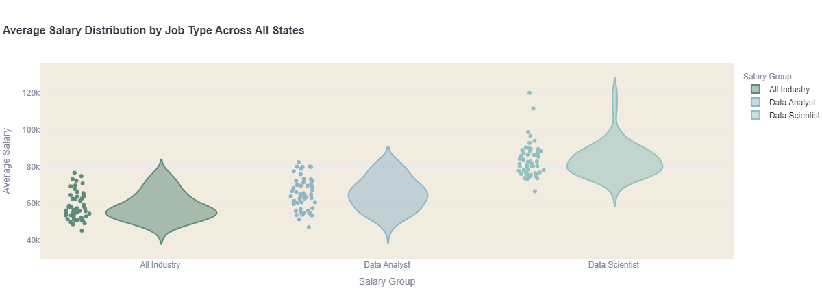
The first distribution to explore takes the average salary by state and compares it in violin and strips plots across all industry salary averages, the average salary for Data Analysts, and the average Salary for Data Analysts. This provides a nationwide perspective of salaries by job type. Here we see that the average salary across All Job Industries for most states hovers under $60k, then tapers off steeply into higher average salaries in certain states. For data analysts, we see not only are they earning more on average overall but that there is a less steep rise to the top of the distribution meaning that there are proportionately higher averages for data analysts across states that have lower average salaries across all industries. Data Scientists are unsurprisingly earning a much higher average salary overall, but it is interesting to note that only among a handful of states are they earning a very high salary average over $100k.
An aspect of this data visible through the interactive plotly graphs is that the distribution of higher salaries in certain states does not necessarily correspond to state with a higher perceived cost of living. For examples, while Data Scientists in California make on average an impressive $120k per year, in Hawaii they make the lowest average of $66k despite both states being associated with high costs of living.
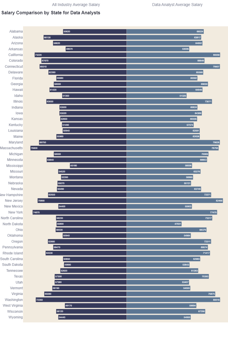
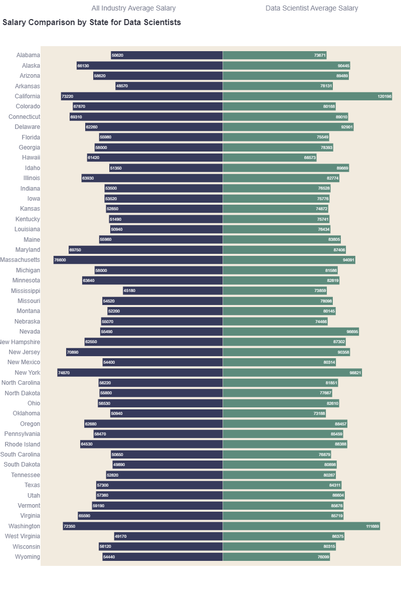
For a closer inspection of this data, we then inspect a pair of butterfly plots. The first of which compares by State the All Industry Average Salary with the Data Analyst Average Salary, and the second compares by State the All Industry Average Salary with the Data Scientist Average Salary. Both plots share a zero-base line through the center of the graph to create a visual comparison the general average salaries to the job specific salaries. Here the averages by each state can easily be viewed even in a static graph.
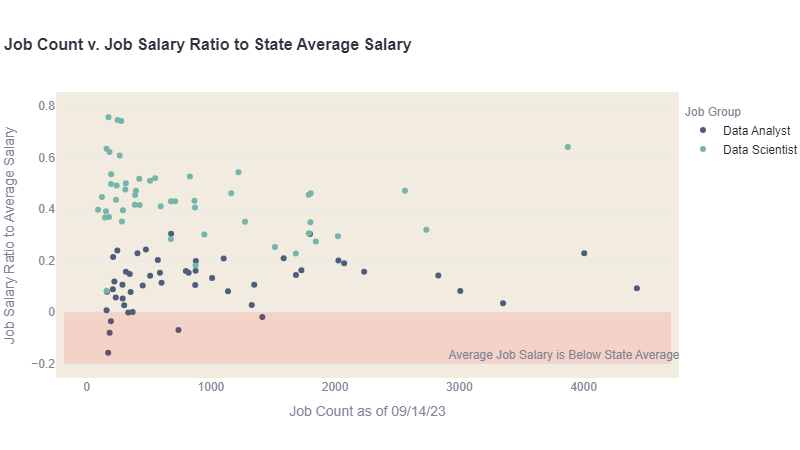
Before moving onto the cost of housing, this analysis also compared performance of job salary above the state average salary to the number of jobs by type in each state using a scatterplot. For the young data professional seeking a first job in the industry, job opportunity is equally important to earning a good size salary. The average salary for each job was dividing by the average wage for the state to give a ratio of how well the job pays on average. As seen in the graph all data scientist jobs made more than the average salary in their respective state. However not all of data analyst roles made more on average in their state than state average salary, show in the red region on the graph.
Additionally, some of highest ratios for job salary above state average salary for data analysts and data scientists also had a fewer number of data analyst and data scientist jobs compared to other states. California, Texas, and New York had both high salary ratios and high job counts for data analysts and scientists. While North Dakota, Vermont, Utah, Alaska, and Colorado had data analysts average salaries below the state average salary with some of the lowest job counts. Hawaii and Colorado while above the state average had the lowest salaries for data scientist with subsequently also small job counts.
3. Rent
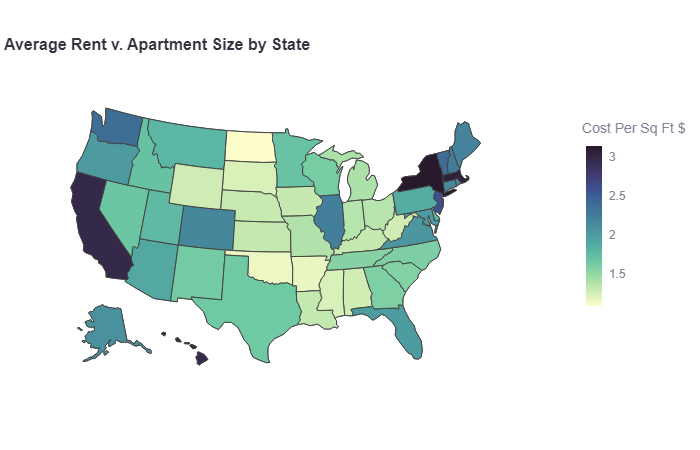
The next figure moves into an exploration of the cost of rent for that first sweet post-graduation apartment. Using a choropleth plot, this graph explores the average rent cost compared to average apartment size by state. This ratio conveniently represents cost per sq ft which was used to generate a heatmap across a map of the United States. The interactive plotly graph provides hover detail to explore what the average is for rent and apartment sizes. On inspection, the darkest states on the map hovering around the $3 per sq ft mark not only have higher average rent costs but have the smallest average apartment sizes under 1000 sq ft.
However since the heatmap here is using a simple ratio, this form of measurement while showing best value for rent does not necessarily provide a comparison of the “best deal” for rent – lowest average rent with largest apartment size. Some states have both lower rent averages with smaller apartment sizes. Creating a “best” metric for this data would be an excellent additional opportunity for further analysis of this dataset.
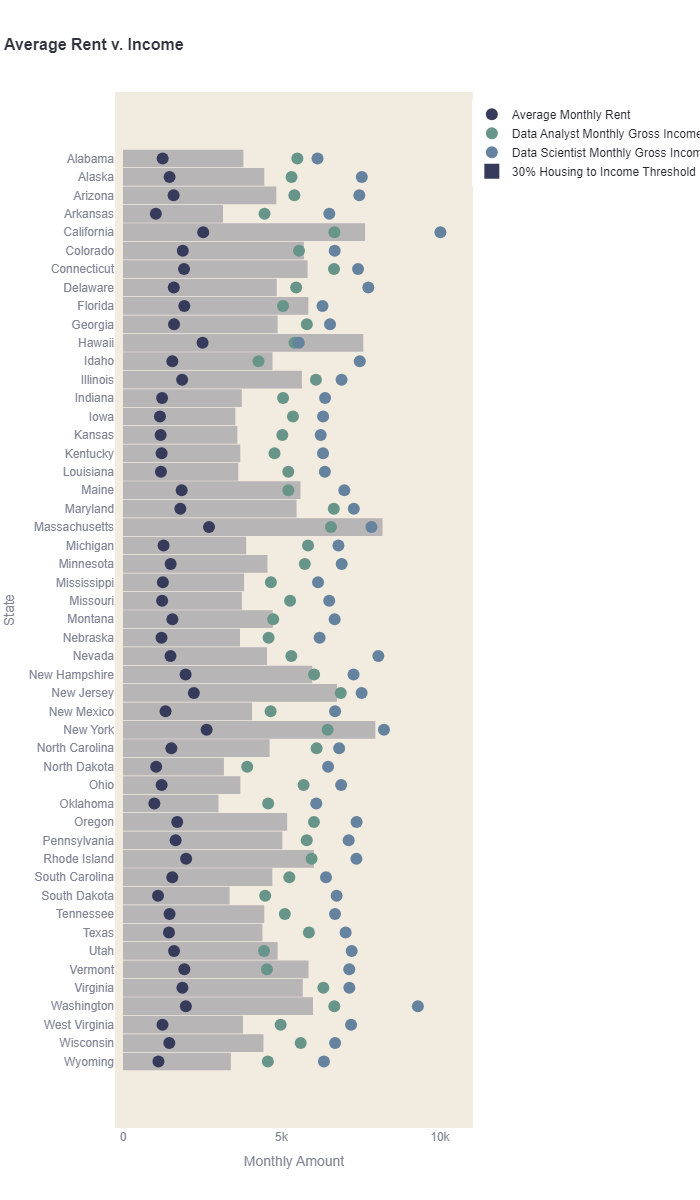
Getting a good deal on an apartment, however, is not the only factor to consider a new graduate. Financial advisors counsel that housing costs should only cost 30% of a household monthly gross income. In fact, many apartment complexes will enforce this practice by requiring that the total gross monthly income for all adult applicants for an apartment be at least 3 times that of the monthly rent cost. This distribution uses a dot plot to map out by state the average monthly rent next the average monthly gross incomes for data analysts and data scientists. The bar in between these markers shows the amount required to cover 3xs the average rent. States where the data analyst or even data scientist markers fall within that bar region indicates states where our recent graduate is more likely to need a roommate to qualify for an apartment.
This is the first figure that really digs into affordability specific to data professionals. As discussed above since the heatmap fails to give us a good assessment of how “expensive” an apartment rent’s is, this visualization for provides a good assessment for how affordable the average rent is for the salaries that state. This graph clearly displays states where data analysts and even data scientists are making more monthly overall than other state but the average rent is high enough that they may still need a roommate to qualify for and afford an apartment. When this map is used in conjuction with the heatmap it can be assessed both the likelihood of needing a roommate as well as the amount a space they have to share.
4. Homeownership
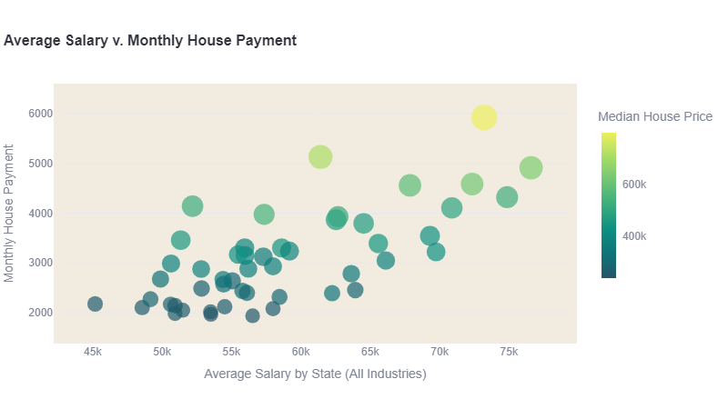
Eventually, there is a good chance that our data professional settles into their career and gets sick of the apartment life. With the present volatile housing landscape the next graph is a bubble chart that simply compares Average Salary by State across all industries to the Average Monthly House Payment. This chart does not distinguish between data professionals and non-data professionals. However as we have explored already, it is easy to infer that a data scientist is overall going to have a much easier time qualifying for a home loan than the average salary in the state, and the data analyst will vary depending on which state they are.
The heatmap component of this graph measures median housing price. While this number is almost parallel to monthly house payment, they do vary slightly. The algorithm used to calculate monthly housing payment assumes the first time buyer is using an FHA loan with a down payment of 3.5% and PMI of 1.5% to calculate monthly mortgage cost. However, monthly house payment also include average home insurance cost and state property tax rates. States with lower home insurance and tax rates could potentially show-up in a brighter color due to higher home price, but still cost less monthly overall than a neighboring marker of a darker color. The biggest value of the heatmap component here is making expensive house prices for states with lower average salaries more visible.
(Additional analysis of this data would benefit from modeling and visualization to assess affordability of homeownership as our data professional’s career progresses. Since data scientists make more money than data analysts, this could crudely because approximated by comparing mortgage affordability for data analysts veruses data scientists. However, the most effective way to measure this would be to add data into this set for the distribution of salaries for each job. Typically the 25th percentile of a salary distribution is considered a junior level salary estimate and the 75th percentile is a senior level salary estimate).
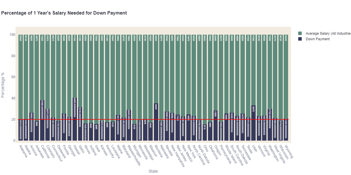
In this expensive housing market, any first-time homebuyer will attest that qualifying for the mortgage is only half the battle with record high down payment costs. Financial advisors counsel to using the 20-30-50 rule for budgeting - 20% savings, 30% wants, 50% needs. The following percentage bar chart shows, average down payment (for a 3.5% FHA loan) to average salary per state. If our data professional is following the 20-30-50 rule then states with closing costs below the red line provided have a down payment low enough to be saved within one year’s salary. State’s above the red line will require multiple years of savings.
5. Tax Burden
The last distribution uses polar bar charts to compare the tax burden by each state according to whether the data professional is a data analyst or data scientist v renter or homeowner. For this model, this assumes that our data professional has chosen to live paycheck-to-paycheck, which insinuates that after income tax has been deducted, that all remaining money in a worst case scenario is also being taxed with sales or property tax. The homeowner benefits from a state with lower property tax than the renter, and the data scientist as the higher average income earner benefits from lower income tax.
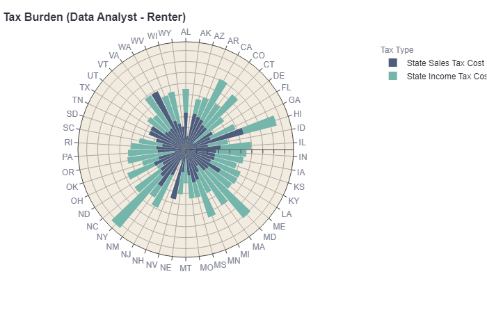
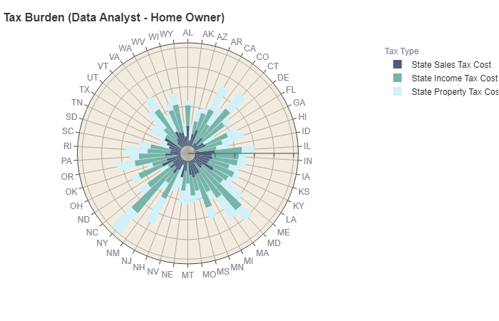
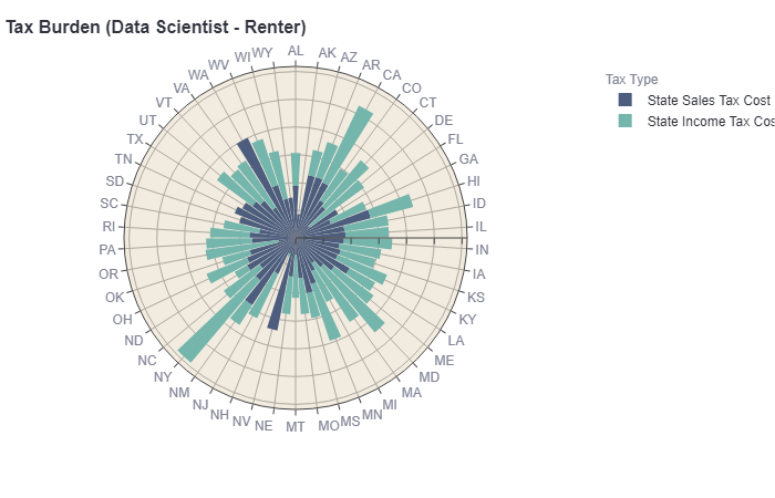
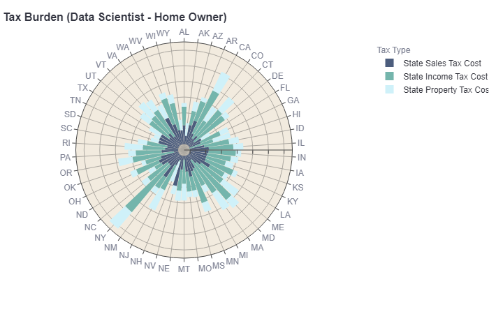
While the polar bar charts make a very interesting and engaging data visualization. Even the interactive version of these graphs failed to be effective in measuring the weight of tax burden on affordability. In additional analysis, it would be more effective to add a model where tax burden is weighs against income and housing cost to visualize the impact it has affordability.
6. Conclusion
This analysis just begins to shows patterns in each state’s cost of living with varying benefits for being a data professional. Ideally this components of this analysis could be expanded to model the affordability of a living area by Metropolitan Statistical Area (MSA) and Core-Based Statistical Area (CSBA) with additional variables to measure cost of living to income and other factors. Ideally these components can then serve as a simulation tool to allow specific analysis of a prospective living area that a recently graduated data professional is considering before accepting a job or moving.